The Psychology of Place: How Color Theory Explains Why Some Cities Feel Happier
The hidden science behind why walking through certain neighborhoods lifts your spirits while others drain your energy.

The Invisible Architecture of Emotion
Walk through the cobblestone streets of Copenhagen, with its pastel-painted townhouses lining the canals, and you'll likely find yourself unconsciously relaxing your shoulders. Contrast this with the experience of navigating the concrete corridors of many post-war housing developments, where the predominant palette shifts to grays and browns, and you might notice a subtle but persistent weight settling over your mood. This isn't a mere coincidence or cultural conditioning; it's the measurable impact of color on human psychology, played out on an urban scale.

Color theory, long understood by artists and designers, reveals itself as a powerful force in shaping our emotional response to cities. When we consider that the average urban dweller processes thousands of visual stimuli daily, the cumulative effect of color becomes not just relevant but crucial to understanding why some places feel inherently more welcoming than others.
The Neuroscience Behind Urban Hues
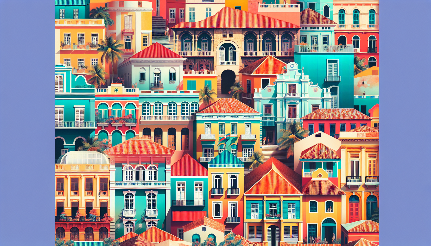
Research in environmental psychology demonstrates that colors trigger measurable physiological responses. Blue tones, prevalent in cities like Santorini or Chefchaouen, Morocco, activate the parasympathetic nervous system, reducing cortisol levels and promoting calm. Meanwhile, warm yellows and oranges (think of the golden limestone facades of Prague or the terracotta rooftops of Tuscany) stimulate the release of serotonin, our brain's natural mood elevator.

But the science goes deeper than simple color-emotion associations. The human visual system evolved to find certain color combinations inherently pleasing because they signal safety and abundance in natural environments. Green paired with earth tones suggests fertile landscapes; blues combined with whites evoke clear skies and clean water. Cities that inadvertently or intentionally mirror these natural palettes tap into millions of years of evolutionary programming.

Dr. Sally Augustin, an environmental psychologist, notes that our brains process color information before we're even conscious of seeing it. This means that a neighborhood's color scheme begins influencing our emotional state before we can articulate why a place feels 'right' or 'wrong.' The implications for urban planning are profound: we're not just designing spaces, we're crafting emotional experiences.
Case Studies in Chromatic City Planning
Consider the deliberate color choices of some of the world's most beloved cities. Barcelona's Gothic Quarter employs a sophisticated palette of warm ochres and deep umbers that creates visual continuity without monotony. Each building maintains its individual character within a harmonious whole, a principle that color theorists call 'unity with variety.'
Conversely, examine cities that feel oppressive or unwelcoming. Many post-industrial urban areas suffer from what researchers term 'chromatic poverty', an overreliance on grays, blacks, and muddy browns that signal decay and neglect. These colors trigger our threat-detection systems, keeping us in a state of low-level alertness that's exhausting over time.
The transformation of Medellín, Colombia, offers a compelling example of color's impact on urban life. The city's urban acupuncture projects didn't just improve infrastructure; they introduced vibrant murals and colorful architectural interventions that measurably improved residents' reported well-being and sense of community pride. The change wasn't merely aesthetic; it was neurological.
The Cultural Complexity of Color
While certain color responses appear universal, rooted in our shared biology, cultural factors add layers of complexity to urban color theory. Red might signal prosperity in Chinese culture while representing danger in Western contexts. White can denote purity or mourning, depending on the cultural context. Successful cities often navigate these cultural nuances, creating color palettes that resonate with their specific populations while avoiding jarring contradictions.

This cultural dimension helps explain why authenticity matters in urban color schemes. Cities that impose foreign color palettes—say, painting Mediterranean blues in northern climates—often feel artificial and uncomfortable. The most successful urban environments develop color languages that feel both locally rooted and universally appealing.
The Economics of Emotional Architecture
The financial implications of color-conscious urban design extend far beyond tourism marketing. Real estate values consistently correlate with neighborhood color diversity and harmony. Areas with thoughtful, varied color palettes command higher prices and experience lower vacancy rates. Business districts with cohesive yet varied color schemes report higher foot traffic and customer satisfaction.
Cities investing in color-conscious renewal projects, from Dublin's colorful doors to Istanbul's restored Ottoman architecture, see measurable returns in both economic development and resident satisfaction surveys. The lesson for urban planners is clear: color isn't decoration; it's infrastructure for human well-being.

Designing Tomorrow's Happier Cities
As we face an increasingly urbanized future, understanding color's role in city happiness becomes essential. Smart cities of tomorrow might incorporate dynamic color systems, LED-lit buildings that shift their hues based on season, weather, or even collective mood data. We might see neighborhoods designed around specific color harmonies that promote different activities: calming blues and greens for residential areas, energizing oranges and yellows for commercial districts.

The challenge lies in balancing scientific insights with cultural sensitivity, individual preferences with collective well-being. But the evidence is mounting: cities that understand color theory's emotional impact create environments where human beings naturally thrive.
The next time you find yourself inexplicably drawn to certain neighborhoods while avoiding others, pay attention to the colors surrounding you. You're experiencing millions of years of evolution and decades of psychological research, all translated into the simple but profound language of urban hues. In our quest to build better cities, perhaps the answer isn't just in better infrastructure or smarter technology. Perhaps it's in the wisdom of a well-chosen palette, painting our urban futures in shades of human flourishing.